A thin black line around an HTML5 <video> element can look like a border, outline, or accidental box-shadow. But in Chromium-based browsers such as Chrome and Edge, that small line is sometimes a rendering seam caused by how the browser composites rounded media layers.
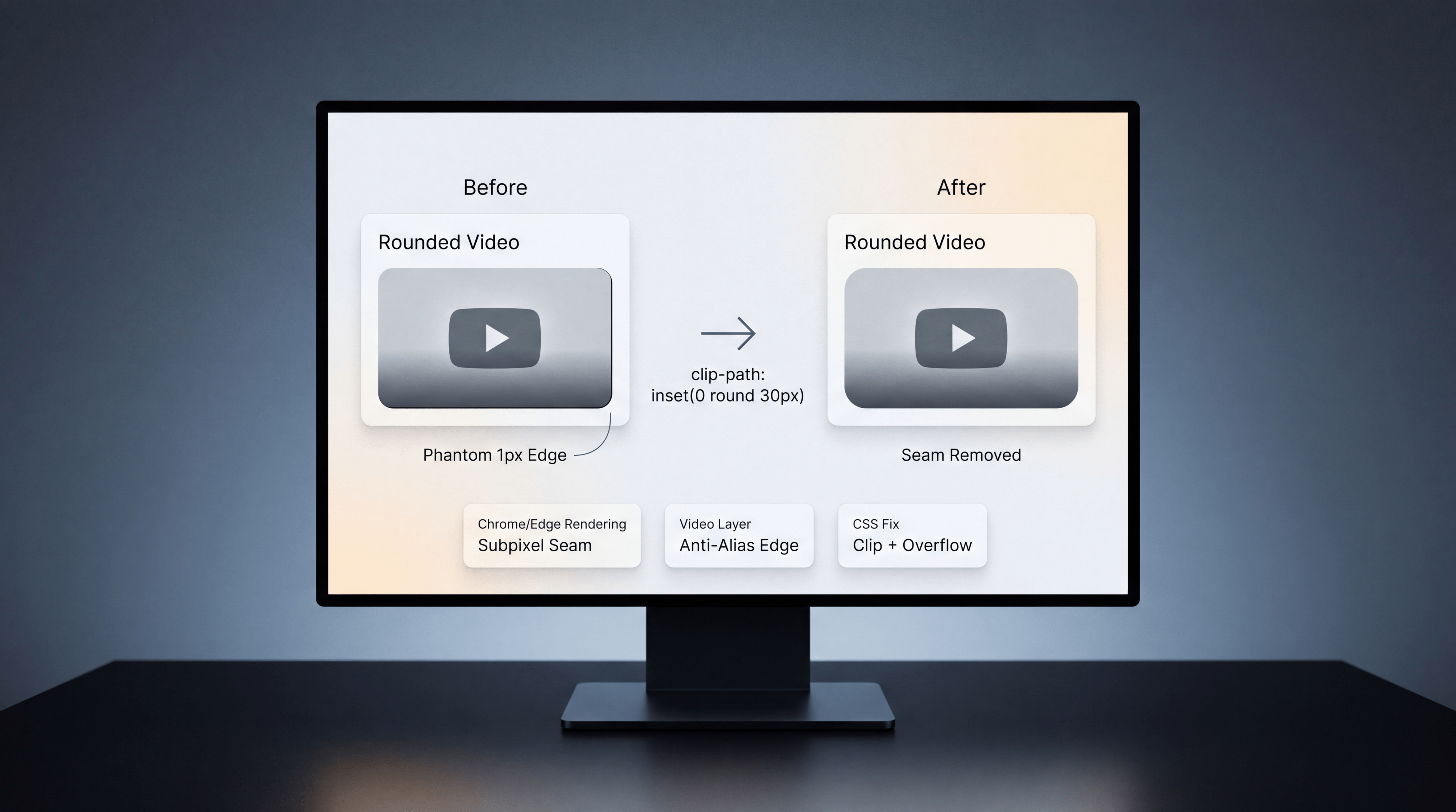
This issue can appear after adding border-radius to a video. The video may look correct in most places, but a faint 1px line appears along the right or bottom edge. It can be especially noticeable on dark videos, rounded corners, or polished landing pages where the media element needs to look clean.
The Problem: A Phantom 1px Border on HTML5 Video
The bug usually looks like a thin black outline on the right or bottom edge of the video. It may appear even when there is no CSS border, no outline, and no box-shadow applied.
That is what makes the issue frustrating. Developers may inspect the element and find nothing obvious in the CSS. The line is not necessarily a real border. It is often a rendering artifact.
This can happen when:
- A video element uses border-radius.
- The browser paints the video as a composited media layer.
- Rounded corners meet anti-aliased video edges.
- Subpixel rendering leaves a visible seam.
In other words, the CSS may be technically correct, but the browser’s rendering behavior creates a visual defect.
Why It Happens in Chrome and Edge
Chrome and Edge are both Chromium-based browsers. In some cases, Chromium can render a subtle compositing seam where rounded corners interact with video layers.
The line may look like an outline, but it is often caused by anti-aliasing at the painted edge of the media element. This is why removing normal border-related properties may not solve the issue.
Common attempted fixes may include:
- border: 0;
- outline: 0;
- box-shadow: none;
- Changing the background color.
- Adjusting the parent container.
Those can help in some cases, but if the issue is the browser’s rounded video seam, the more reliable fix is to avoid relying on border-radius directly on the video edge.
The One-Line Fix: Use clip-path Instead of border-radius
The clean fix is to use clip-path: inset(0 round 30px); with overflow: hidden; instead of relying only on border-radius rounding on the video.
The core rule is:
.video-rounded {
  display: block;
  margin: 0 auto;
  overflow: hidden;
  clip-path: inset(0 round 30px);
  border: 0;
  outline: 0;
  box-shadow: none;
}
The important part is:
clip-path: inset(0 round 30px);This clips the video into a rounded shape in a way that avoids the visible anti-alias seam that can appear with border-radius on media elements.
The Exact CSS Pattern
For a centered video with a fixed width and rounded corners, the rule can look like this:
#advertorials-video {
  display: block;
  width: 50%;
  margin: 0 auto;
  margin-bottom: 15px;
  overflow: hidden;
  clip-path: inset(0 round 30px);
}
This keeps the video centered, applies the rounded visual treatment, and clips the edge cleanly.
Why clip-path Works Better Here
border-radius rounds the visual corner of the element, but media elements can still create edge artifacts depending on how the browser composites the video layer.
clip-path handles the rounded clipping in a different way. Instead of depending on the video’s rounded paint edge, the browser clips the visible area to the shape defined by the inset and radius.
That means the seam is less likely to appear because the video is clipped cleanly inside the rounded boundary.
Use overflow: hidden with the Fix
overflow: hidden; is important because it helps ensure that any internal bleed, chrome, or edge rendering does not show outside the clipped area.
Together, these two declarations create the practical fix:
- overflow: hidden; clips content that spills outside the element.
- clip-path: inset(0 round 30px); creates the rounded clipping shape.
This combination is simple, readable, and easy to apply across video elements that need rounded corners.
Common Culprits If the Line Still Appears
If the seam does not disappear immediately, there may be another layout issue contributing to the visual line.
1. Inline Video Baseline Gap
By default, media elements can behave like inline elements and leave room for text descenders. Setting the video to display: block; can remove that extra baseline space.
video {
  display: block;
}
If the video must remain inline, vertical-align: top; may help.
2. Parent Line-Box Issues
If the direct parent creates a line box around the video, try setting:
.video-parent {
  line-height: 0;
}
Then restore normal line-height for text elements inside the same parent if needed.
3. Container Height Problems
Some seams come from container sizing rather than the video itself. If a parent container uses height: 100%; unnecessarily, test removing it or using height: auto;.
4. Letterboxing or Aspect Ratio Mismatch
If the video’s aspect ratio does not match the display container, letterboxing can create dark edges that look like borders.
Use aspect-ratio and object-fit intentionally:
video {
  aspect-ratio: 16 / 9;
  object-fit: cover;
}
Use cover when you want the video to fill the container, and contain when preserving the full video frame matters more than filling the shape.
5. Extra Browser or Theme Styling
Resetting visual extras may still be useful:
video {
  border: 0;
  outline: 0;
  box-shadow: none;
}
If accessibility focus rings are important for your use case, be careful with removing outline. Do not remove keyboard focus visibility from interactive elements unless you replace it with an accessible alternative.
6. Compositor Hairline Issues
In some edge cases, forcing compositing with transform: translateZ(0); may help. This should be tested carefully because rendering optimizations can vary by browser, device, and layout.
Browser Support Notes
clip-path: inset(... round ...) is supported in modern evergreen browsers. For very old browsers, border-radius can remain as a graceful fallback, but that may reintroduce the original seam in browsers affected by the rendering issue.
For most modern production websites, the clip-path approach is practical and clean.
Why This Matters for Premium Web Design
A 1px seam may seem small, but visual polish matters. On a professional website, a thin unexpected line around a video can make the design feel unfinished, especially on hero sections, advertorial pages, landing pages, product demos, and branded media layouts.
Clean video presentation affects:
- Perceived quality.
- Brand trust.
- Landing page polish.
- User experience.
- Frontend implementation quality.
Small CSS details often separate a layout that works from a layout that feels professionally finished.
Frontend and Web Development Support from Changing Crowns®
Changing Crowns® supports software engineering, frontend refinement, WordPress development, custom digital tools, and polished web implementation. Details like video seams, rounded media edges, layout behavior, browser quirks, and performance-sensitive presentation all affect how a website feels to real users.
From debugging frontend issues to building custom web systems, Changing Crowns® helps businesses and founders create digital experiences that are functional, clear, and professionally executed.
Explore software engineering, web development, and digital strategy support at changingcrowns.com.
Quick Summary
If an HTML5 <video> shows a thin black 1px seam in Chrome or Edge after adding rounded corners, the issue may be a Chromium compositing artifact rather than a real border. Replacing direct border-radius rounding with overflow: hidden; and clip-path: inset(0 round 30px); can eliminate the seam and create a cleaner rounded video presentation.